Opening New Doors: The 4 Buyers Brand Redesign Story
Any graphic designer will tell you that rebranding is equal parts fun and intense. You have to dig deep into what makes a company unique: who they are, who they serve, and how they want the world to see them. But redesigning the 4 Buyers Real Estate brand? That was something extra special for me because I wasn't just a designer—I was a past client. My husband and I bought our first home with Dave Twombly in 2022, so this was a project I felt on a whole different level.
It was so easy to slip back into the mindset of first-time home buying…the excitement, the nerves, the “wait, what’s escrow again?” moments. I remembered the questions we had, how our needs evolved, and what resources would’ve made the journey smoother. And now, I had the chance to create those tools for future buyers. Honestly, it felt like a full-circle moment. (Also, let’s be real: I will never pass up a chance to work with Dave. Ever.)
We kicked things off with a fun exercise: I asked Dave to pick five words that best describe 4 Buyers Real Estate. This kind of information gives the entire brand a clear focus and a foundation to build from. His picks were agile, ethical, trusted partner, educational, and forward-thinking.
So how do we turn those five words into a brand you can see, feel, and connect with?
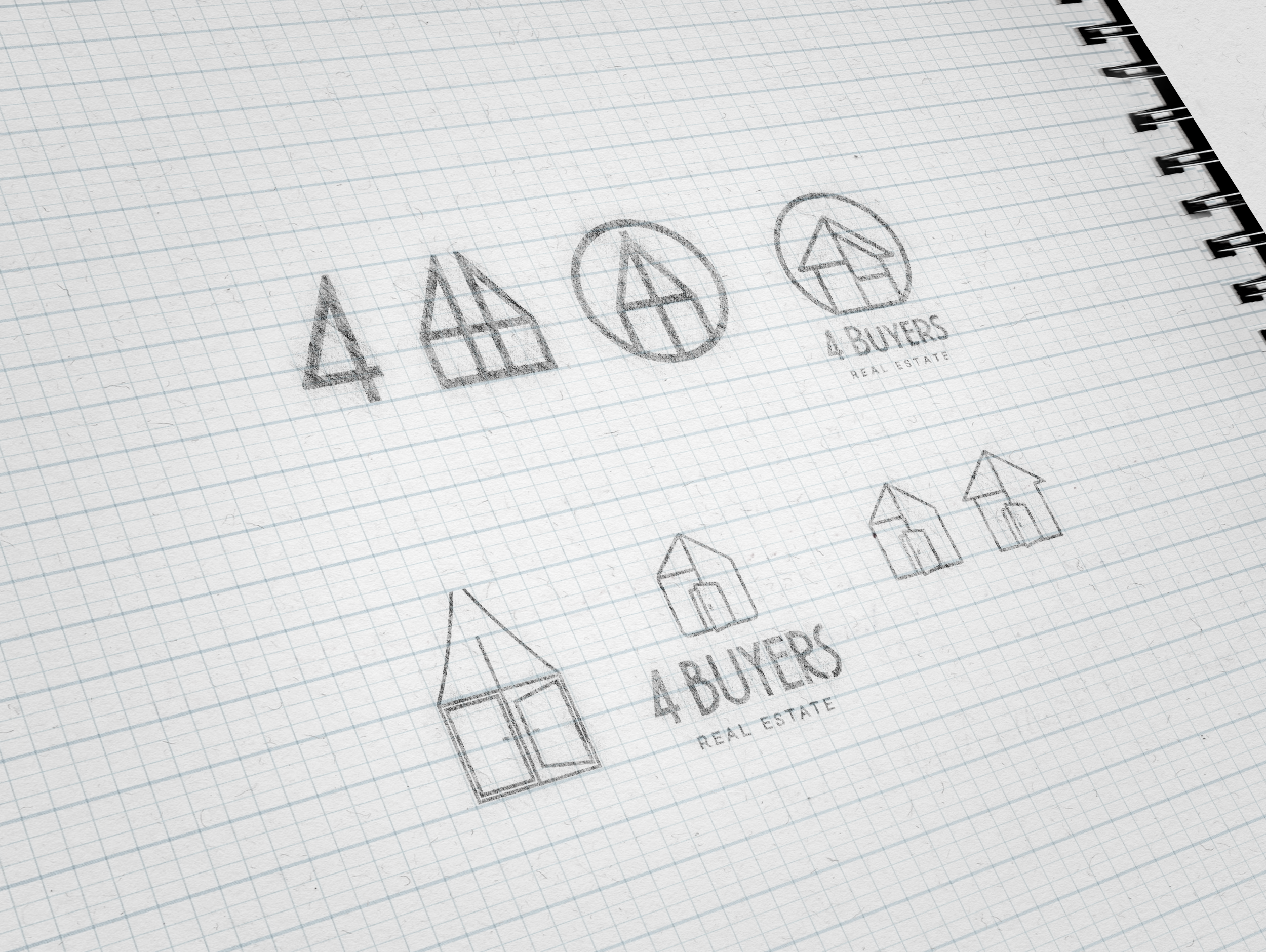
We started with the logo. The goal was to make it feel modern and welcoming, but with enough polish to reflect the team’s deep experience. We brightened the color palette, added more saturated tones, and picked a font with unique shapes to help complete the visual aesthetic. And because 4 Buyers has a long history, we didn’t throw everything out—we kept the core concept (a house made from the number “4”) and refined it. The updated house icon now features a clearly open door, which we love: it welcomes people to the brand, to the 4 Buyers family, and to their future homes.
After completing the foundational brand elements (logo, color palette, business cards, and stationery), we shifted focus to the website. Beyond sharing company and team info, the goal was to educate all home buyers, not just clients. The original 4 Buyers site was full of valuable content, but it needed to be more accessible. Collaborating with copywriter Brianne Miers, we developed a new site map to prioritize content and guide user flow. The biggest challenge was the “Where to Start” section, which evolved into an interactive timeline offering a clear overview, with the option to dive deeper into each phase on the path to homeownership.
In the end, this project was more than just a rebrand; it was a chance to translate the heart of 4 Buyers Real Estate into something visual, accessible, and genuinely helpful. From the refreshed logo to the user-friendly website, every piece was designed with real people (and real home-buying!) in mind. It’s not every day you get to blend your personal experience with your professional skills—and doing it with a team I trust and enjoy made it all the more meaningful.
Here's to the continuation of 4 Buyers as an invaluable resource, and to helping more buyers feel confident, informed, and excited about the journey ahead.
Julia Rand is the owner of Bayerand Design & Consulting.


